Forex trading charts may appear simple at first glance, but they contain a wealth of information that can be unlocked with the right tools and knowledge. Here’s what you need to know to read one properly.
What are forex trading charts?
Forex trading charts are charts that display the price movement of a pair of currencies relative to each other, over time. They are an essential tool used by forex traders to keep an eye on price action and stay ahead of important developments.
As factors such as price and trading volume change, forex trading charts can form trends and patterns. These can be deciphered as signals of impending developments, such as whether a price trend will reverse or continue, or potential entry or exit points.
Learning how to spot and interpret trends and patterns in a forex chart is a core tenet of technical analysis. Technical traders combine additional charting tools and indicators with forex trading charts to better discern opportunities and confirm/deny trade ideas.
Understanding forex trading charts
A forex trading chart can range from basic to sophisticated, depending on the platform used, and the degree of technical indicators and tools deployed.
Even in its most basic form, a forex trading chart contains plenty of helpful information, chief of which is historical price data over a defined time frame.
Some traders believe that price action is the only factor that matters, to the point that they rely exclusively on recent price action and the formations and trends extrapolated from it to make their trading decisions. This mostly happens with short-term forex traders and day traders, especially swing traders and trend traders. [1]
In any case, forex trading charts commonly contain the following components.
Price
The price of a currency pair is the most prominent feature of a forex trading chart. It may be displayed as a continuous line, or a series of bars or candlesticks, depending on the chart type.
As the prices in a forex trading chart indicate the value of a currency relative to another, you will only see one price, and not two. For instance, on the USD/JPY chart, you may see 194.95. This means that 1 US Dollar is trading for 194.95 Japanese yen.
If you want to find out how much is 1 Japanese Yen worth in US Dollar, you’ll look up the JPY/USD chart for the answer.
Name of the currency pair
Naturally, a forex trading chart will also contain the name of the currency pair it is charting. The forex pair will be named according to standard conventions: base currency/quote currency.
For example, a forex chart named USD/JPY tells us that the two currencies being compared are US Dollar and Japanese Yen. Importantly, the chart is showing us how much Yen is required to purchase 1 USD at different periods of time.
Hence, if the US Dollar strengthens against the Yen (i.e., 1 USD buys more Yen), the USD/JPY chart would rise. Conversely, if the US Dollar weakens against the Yen (USD buys less Yen), the USD/JPY chart would fall.
Drawings and Indicators
These are not inherent to forex charts, but there are many platforms such as TradingView that allow you to include drawings and indicators on a forex trading chart.
These may range from simple visualisations such as trend lines, lines of resistance and support and trading volume, to more sophisticated items such as oscillators.
Additionally, forex charts drawn up in candlestick format may be read for patterns – these may be thought of as another set of indicators.
Forex trading chart types
Like all price charts, forex trading charts can take the form of line charts, bar charts or candlestick charts. The main differences among them lie in readability and depth of information.
Line chart
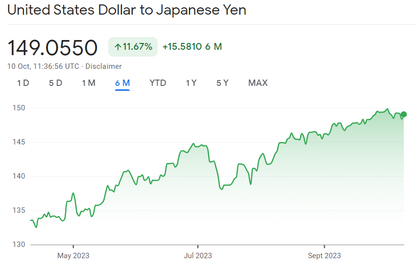
Let’s start with the simplest. Forex line charts display the price of the currency pair in a continuous line that joins all trading periods. Only the closing price of the pair is displayed.
Line charts are the easiest to read and can adequately convey price trends. In the example shown above, we can see the USD/JPY chart moving upwards over the past six months. This means that the USD has strengthened against the Yen.
Meanwhile, during July, we see a small downtrend. We can thus deduce that during this period, the Yen temporarily gained in strength against the US Dollar.
Line charts are intuitive and easily understood, but they do not convey much information beyond uptrends and downtrends.
Bar chart
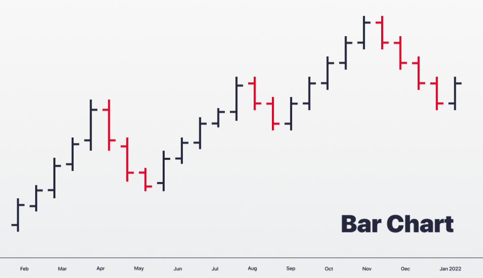
A forex bar chart looks quite different from a line chart. Instead of one continuous line, you can see a series of vertical bars with short horizontal lines near the ends. Each bar represents a separate trading period, and when lined up in order, we can read the price history of the currency pair being charted.
We can see uptrends and downtrends, and even see red bars indicating that the pair closed lower that day (which, of course, means, the quote currency strengthened against the base currency).
But there’s also another layer of information we can glean from a bar chart, and we’ll need to zoom in to learn what that is.
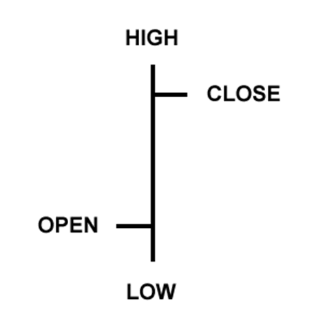
As you can see, each singular bar has four points, representing the following:
- High: The highest price of the currency pair during the trading period
- Low: The lowest price during the trading period
- Open: The price of the pair at the start of trading
- Close: The price of the pair at the end of trading
By studying these four data points, we can infer additional information from a bar chart, such as volatility and market sentiment.
Candlestick chart
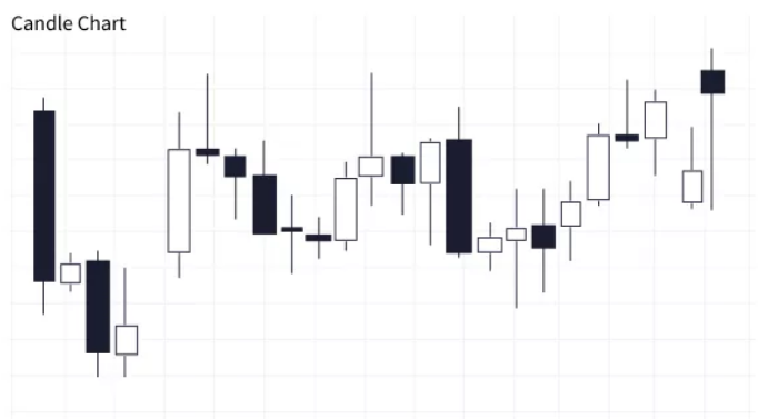
A candlestick chart offers similar depth of information as a bar chart but differs in style and presentation.
As you can see from the example above, a candlestick chart consists of a series of candles – solid bars with wicks or shadows at both ends. Every candle represents one trading period, and when lined up, charts the price history of the underlying currency pair.
However, notice the wick-and-body format makes for more intuitive reading of information, once you understand what each complement means.
The candle or body
This represents the difference between the opening and closing price of the currency pair. A long body means a large difference between the two, and a shorter body means a smaller difference.
Also, when the pair closes the day at a lower price, the body is coloured a different colour (commonly red) to distinguish it. Correspondingly, when the price closes higher, the body of the candle is coloured green.
This format makes it easy to tell price trends at a glance; just count the number of green vs red candles.
The wicks
The wicks are used to indicate the highest and lowest prices seen during the trading period. The upper wick marks the highest price bid, while the lower wick marks the lowest price bid.
Wick length can be used to vague market sentiment. A long upper wick represents exuberance and strong bullish momentum, while a long lower wick means weak sentiment with strong bearish momentum.
Candlesticks charts are clearly more readable than bar charts, while being able to convey information that is just as rich. Hence, candlesticks charts are more widely used by forex traders of all experience levels.
A note on timeframes
One key feature to note is the timeframe on a forex chart.
Given the nature of forex trading, forex charts can be set according to a wide range of timeframes. You can choose timeframes showing currency price movements over yearly, monthly, weekly, or daily timeframes. You can even drill down to intervals as short as every hour or minute!
As you can imagine the timeframe will vastly affect how the price chart looks. Thus, it is crucial to set your forex chart according to an appropriate timeframe; this will depend on the forex trading strategy you plan to use.
How to read forex charts
Candlestick patterns
There’s another reason why candlestick charts are highly popular among forex traders – candlestick patterns.
These refer to the patterns that form when certain combinations of candlesticks come together, the appearance of which signal a greater likelihood of a trend change. This may sound unbelievable, however, remember that candlestick charts are created using past price action, so it’s not completely baseless.
Here are some of the more common candlestick patterns, and what they mean.
| Candlestick pattern | Trend indication |
| Hammer A single green candle with a short body and a long bottom wick (at least two or three times the height of the candle), with little or no top wick. | Bullish |
| Bullish Engulfing A short red candle followed by a much longer, green one, indicating prices are being pushed higher. | Bullish |
| Three White Soldiers Following a severe downtrend, three consecutive green candles appear, with each one closing higher than the last. The longer the body of each subsequent candle, the stronger the likelihood of an uptrend. | Bullish |
| Hanging Man A single red candle with a short body and a long bottom wick (at least two or three times the height of the candle), with little or no top wick. | Bearish |
| Bearish Engulfing A two-candle pattern where a green candlestick is followed by a larger red one. Present when there is switch reversal in market sentiment. | Bearish |
| Evening Star A three-candle pattern starting with a long green candle, a short candle (red or green) in the middle and ending with a long red candle. This pattern shows market indecisiveness pushing the markets bearish. | Bearish |
Technical indicators
Even though – as mentioned earlier – forex traders believe that price action is all you need for trading in forex market, technical indicators can offer another layer of information to further strengthen or challenge your investment thesis.
Here are some popular indicators that could work well with forex trading.
Lines of support and resistance
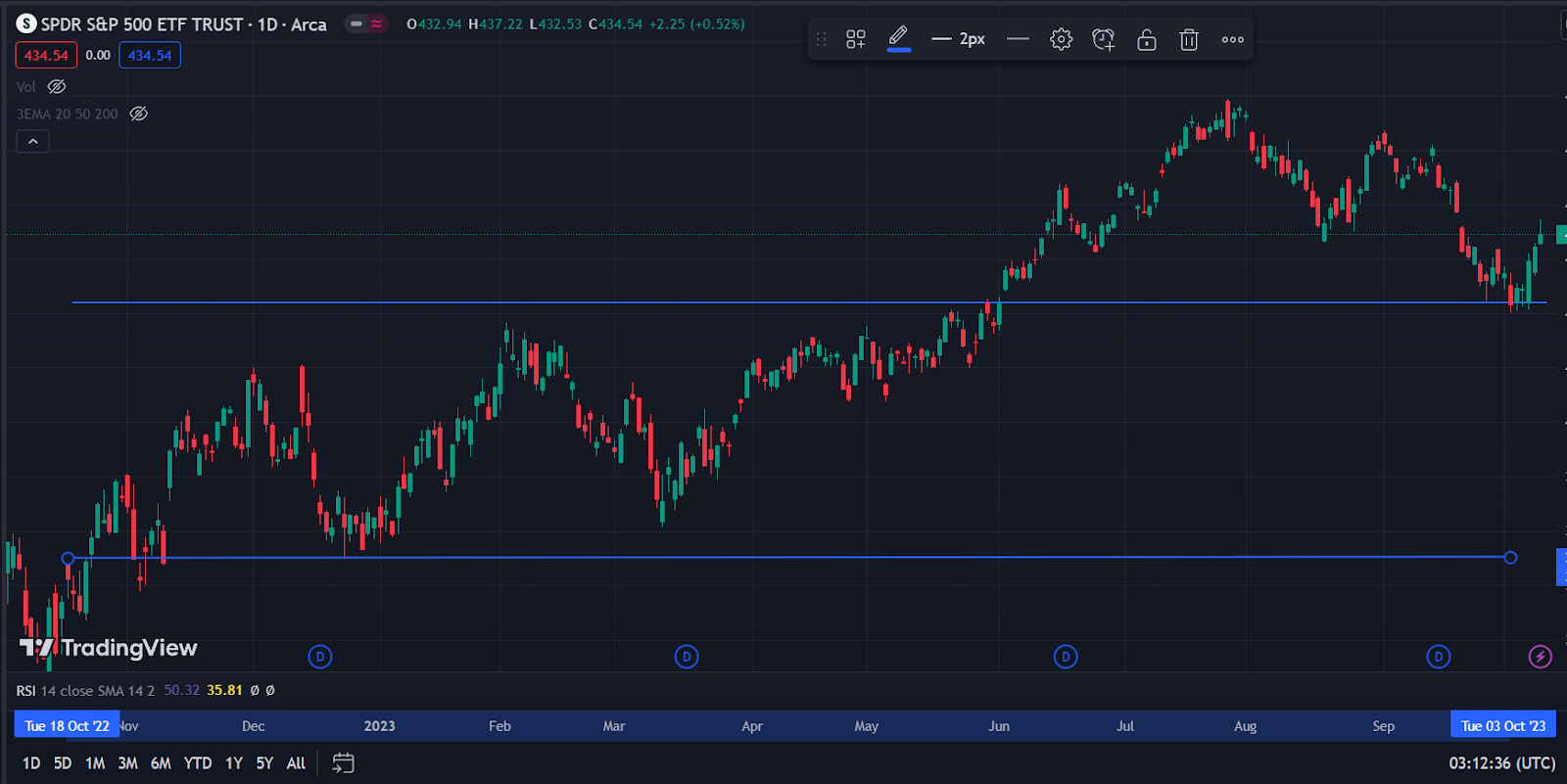
One simple but highly useful technical indicator is trendlines, which can also be used to draft support and resistance levels.
In the screenshot above, the two blue lines are trendlines. The lower line indicates the lowest price between Oct 2022 to March 2023. You can see the price bouncing off this line several times; thus, we can say this is a line of support.
Lines of resistance, on the other hand, marks the highest price within a stipulated duration. In the screenshot above, the higher blue line is the line of resistance for the period between Oct 2022 to March 2023. Once again, you can see the price does not break through the upper blue line, even though it approaches it on several occasions.
However, going into June, we see the price breaking through the line of resistance, and continuing to chart new highs before briefly dropping back down in October; at this point, you can see the price touching the upper blue line before bouncing back up again.
In this case, the upper blue line acts as a line of resistance from Oct 2022 to March 2023, and turns into a line of support from June 2023 onwards.
Lines of support and resistance help us find breakout points, which may act as entry or exit points, depending on your strategy.
Moving averages
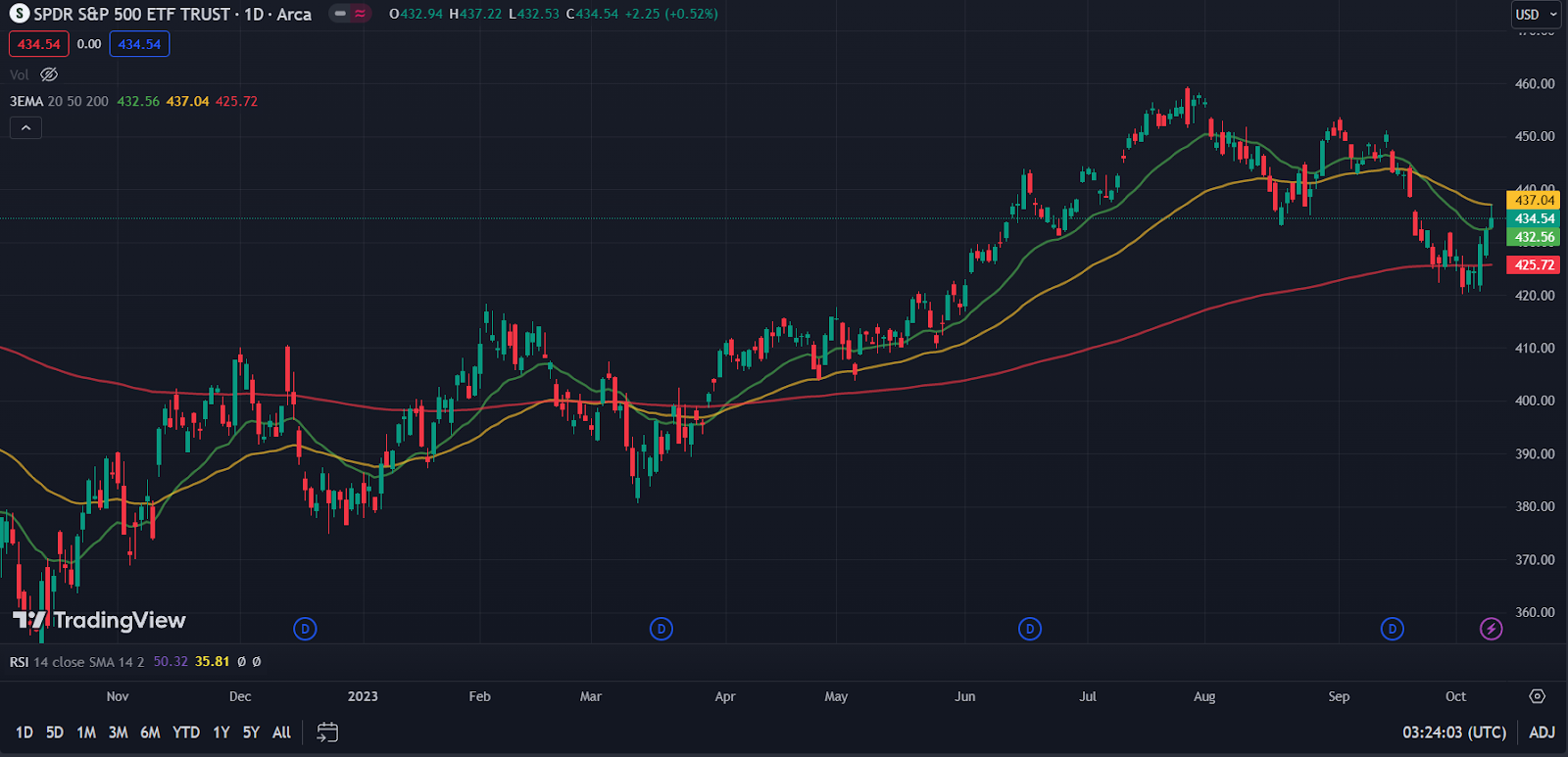
Moving averages measure the average price of a currency pair over a set period of time. You can choose different time periods and can add more than one moving average to your chart.
When used correctly, moving averages can reveal the strength, direction and duration of a trend. This can be accomplished by choosing a variety of moving averages with different time frames, and observing when they cross over or under each other.
In the screenshot above, three moving averages are displayed, with 20-day, 50-day and 200-day time frames selected. When shorter-term moving averages cross under a longer-term one, this indicates a coming uptrend. However, when shorter-term moving averages cross over a longer-term one, a downtrend may be on the cards.
The use of three moving averages offers an extra layer of confidence – the trend is strongly confirmed when all three lines cross. However, it is essential to acknowledge that market dynamics can be included by multitude of factors and occasional shifts can occur from time to time.
Relative Strength Index (RSI)
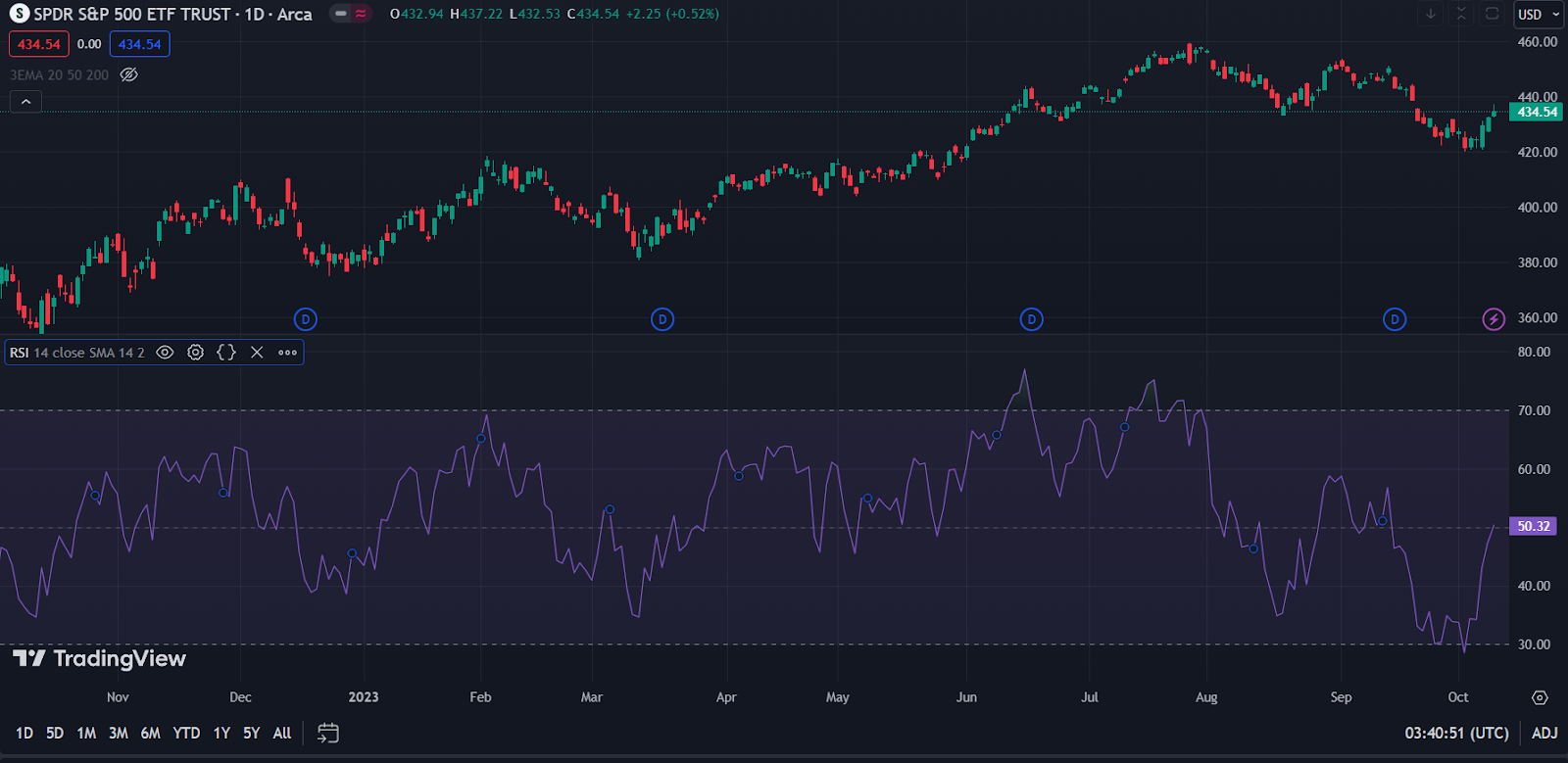
Relative Strength Index is a type of technical indicator known as an oscillator, or momentum indicator. It is shown above as the purple portion in the lower half.
As a currency pair closes higher each day, the RSI slopes upwards, indicating mounting momentum. The opposite happens when the currency pair starts closing lower; momentum weakens, which is shown with a downward sloping RSI.
Additionally, the RSI also helps us understand when a currency pair is overbought or oversold. When the RSI reaches 70 or higher, the currency pair is generally thought to be oversold, and a trend reversal may be near.
When RSI is 30 or lower, the currency pair is regarded as oversold, and prices may soon start moving upwards.
Conclusion
Forex trading charts are a highly useful and versatile tool, and the addition of technical indicators can help make them even more illuminating.
Those who are serious about learning forex trading should make it a point to familiarise themselves with forex price charts and hone their skills in reading and interpreting the patterns accurately.
Just remember that no tool is capable of providing 100% accuracy when trading the markets, so be sure to temper your expectations and avoid being overly reliant on forex charts.
References
- “Price Action: What It Is and How Stock Traders Use It – Investopedia” https://www.investopedia.com/terms/p/price-action.asp Accessed 18 Oct 2023